Y E L T A ' S A N A L Y S I S :
F A C T S A N D E X P E R I E N C E A B O U T W H A T M A K E S A C O L O R C O M B I N A T I O N S U I T E D F O R 1 B I T A R T
The Warp Zone
“1-Bit color palette”. When I began my research on that topic, I used this term ironically. Can you really call it a palette, if there are only two colors?
There are amazing color palettes for 1bit. The Lospec community agrees with me that Polyduck‘s Monitor Glow and Pixel Ink are absolutely top class. While I'm writing this, they're by far the most downloaded 1bit palettes on the color palette forum. In my opinion, Pixel Ink is one of, if not the best Dark/Light color palette so far. Another palette almost on that level is Batfeula's iconic black and yellow palette, that he uses in almost all of his 1bit pieces. Truly a signature: When I see black and yellow pixel art, I immediately assume it‘s made by Batfeula or has something to do with him. And it‘s punchy, clear, and stands out. It suits his low resolution comic figures well, but even fits my noisy high res art styles.
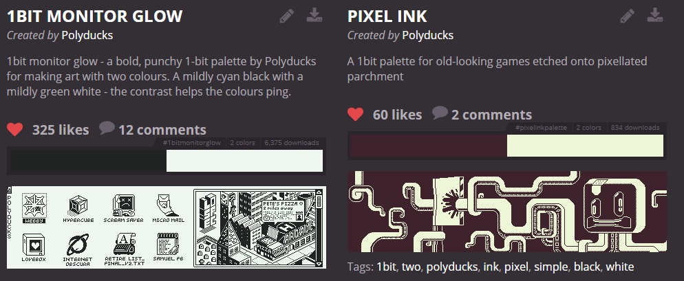
[01] The rating of Polyduck's palettes on Lospec.com
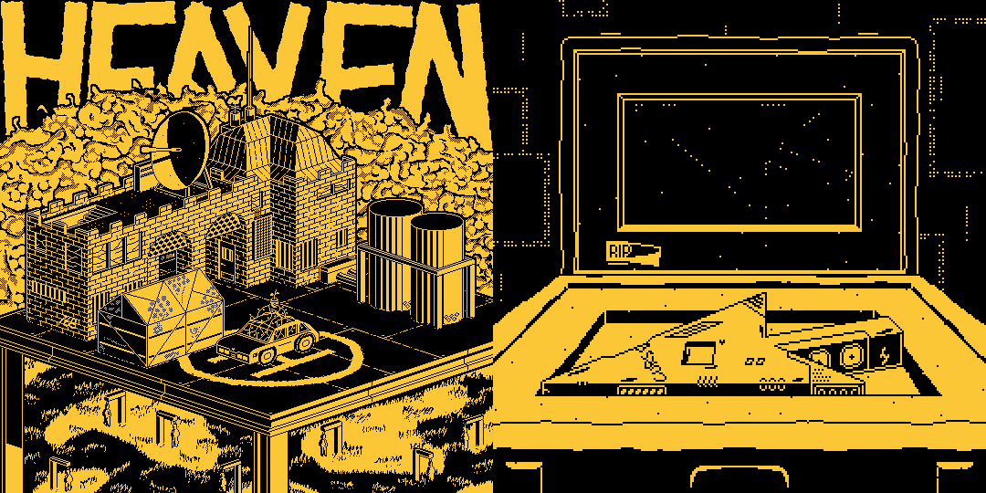
[02] Batfeula's signature palette applied on two of my artworks
If you were to randomly pick two colors, or even pick two colors out of a pool of only good colors, you would not get close to palettes like this. There has to be at least some thoughts put into it. Obviously. I came into the 1bit scene with more ideas than experiences, more innovation than knowledge. I used Color/Light and Color/Color palettes as often as possible, just because barely anyone else uses them. And most of the palettes worked out well! However, for creating them, especially Color/Color, you'll already need some number-based color theory: Since the HSV Saturation and Value are close to another, which is always the case when both are colors, most of the contrast has to come from the Hue.
I will refer to the HSV values as Hue, Saturation, and Value, with capital letters. This is to clear up any confusions that might occur because a color has a lot of values (red value, blue value, Saturation value, Value value...) but only one Value (the brightness in HSV).
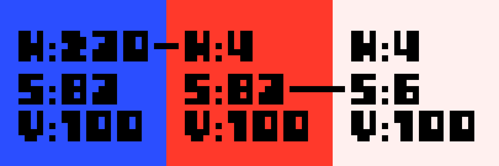
[03] Contrast can be generated with each of the HSV values.
Let’s take an easy example here: If you put blue and purple next to each other, you'd think that they are quite easy to distinguish. And then you put it into an art piece, with over 200 pixels height and some dithering, and it completely blurs together. If you now replace the purple with yellow, changing only the Hue and leaving the Saturation and Value as they are, you have a gigantic contrast.
[04] The contrast between colors can be completely different depending on just the hue.
So there is in fact some number based color theory even behind two color palettes. And that’s what I made this project for. To take this as far as possible. I wanted certain numbers. I wanted scientific proofs. I wanted rules. If I had gotten any of them, I’d have made a tutorial on that, instead of writing this. What really matters when doing these palettes is experience, and to learn about the topic. Either by creating more palettes yourself, or by reading the rest of this article.
(If this was a Youtube video, I would say something cool here, like "lean back and let me take you on this two-colored adventure", but it isn't, and you actually have to put effort into reading this, so I guess I'll just go on and feel only half as cool as I could be.)
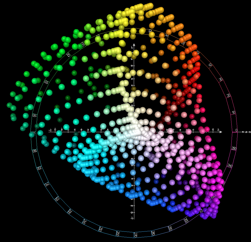
A common way to differentiate between 1bit color palettes - I did it already even in this article - is with the categories Dark/Light, Dark/Color, Color/Color and Color/Light. In a Dark/Light palette for example, one color is very dark, and one is very light. Sure, it can be hard to tell whether a pixel is more Dark or more Color, if it is a dark blue for example. In HSV color space, a Color has high Saturation and Value, a Light has a way lower Saturation than Value, and a Dark has a low Value. You get the idea. There is no sense in exactly defining this with certain HSV values, but you can make a coordinate system-like graph, with each of the extremes in one of the corners: Black and White as Dark/Light at the top left, Black and Red as Dark/Color at the top right, Blue and White as Color/Light at the bottom left and Red and Blue as Color/Color at the bottom right. The y-axis measures the darker color’s Dark to Color, and the x-axis measures the lighter color’s Light to Color. It is quite easy to estimate where a palette would be placed on that graph. Sounds complex, but really isn't.
[05] The palette coordinate system as shown in my 1bit tutorials
Maybe you noticed that this way you can't put Dark/Dark or Light/Light palettes on there. And that is right, but not too big of a deal.
Surely, there is great "low contrast" art, even in 1bit, with two very light colors. And generally speaking, it's art, nothing is forbidden, if you do it on purpose. Low contrast palettes are great for mysterious pieces, or the illusion of fog. But in most cases, that's the opposite of what we want, we want palettes that are clear, punchy and readable. For generally appliable palettes like Monitor Glow or Batfeula's Signature, we can't use them.
Note that common low contrast art is usually not Dark/Dark or Light/Light too, but simply Color/Color. Dark/Dark can be used for dark art, and Light/Light for an exaggurated dotpict (japanese) vibe. This is not often done though.
[06] A Light/Light palette
With that lesson about 1bit palettes learned, I can call the categories d/l, d/c, c/c and c/l from now on. But I won't bring them up too often from now on. You see, the categories have different vibes to them, and are differently hard to create, but there are good palettes for all four kinds. Monitor Glow is a great d/l, Batfeula’s is a great d/c. C/l and c/c are a lot rarer, but I made some that I'm really happy about, and Gato Roboto's Starboard and Port palettes are good examples. If we to measure a palette's objective quality, this simply doesn't matter.
So I wrote a Python script, extracting data from 15 good color palettes, and calculating new data with it. Or in fact, I copied most of the code from the internet, because what do I know about converting color spaces? I was quite surprised by how it works actually, but that's another topic entirely. Let me go over each new value that the script calculates now:
RGB Difference
To get this straight right away: RGB is awful for color theory. I knew that. But since it is only one of many categories, and quite easy to do, I thought it wouldn’t hurt to include it, and it didn’t. Also, the value is named “Difference” here. And that’s what it is, a difference between two times three numbers, the red, green and blue value of each color. Similar to "contrast", but a contrast exists between two colors, while a difference exists between two numbers. Since RGB makes numbers out of colors, instead of subjectively telling how a color looks like, "difference" is the right term here.
To get bigger differences between the different palettes, I squared each RGB value's difference before counting them together.
(r1 – r2)² + (g1 – g2)² + (b1 – b2)²
RGB Brightness
This one’s easy. Just add all RGB values together and you know how bright your palette is. In RGB at least, which is made for computer monitors, and not human eyes. But again, it didn’t hurt to include it.
r1 + r2 + g1 + g2 + b1 + b2
Value Brightness
The second color system, HSV, normally used for creating palettes. By adding up the HSV Values we get a Brightness that already makes more sense than RGB, but still not much.
v1 + v2
Saturation Sum
Alright, maybe I don’t have to go over every single one individually. We add up the Saturations here.
s1 + s2
Hue Difference, Saturation Difference, Value Difference
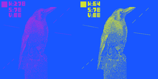
This is where it gets interesting. Because you might think this makes sense, but it still has big flaws. The thing is: The Value does not determine the darkness: not only a low Value, but also a low Saturation makes an image lighter. Saturation does not tell us how strong colors are, because a low Value also makes them weaker. And Hue is flawed on it’s own: The following numbers are subjective, but for me the Hue is more green than yellow starting at Hue 90 and it gets cyan at 155, means 65 hues are green. Pink gets red at 350 and then it becomes orange at 15, means only 25 hues are red. See the problem?
[07] I wonder what my colorblind friend's opinions are on this
h1 – h2 ; s1 – s2 ; v1 - v2
HSV Difference
The differences, each squared and then all added together. The most useful number to determine the contrast, so far. It even noticed that the highest contrast is not Black and White! The reasons for that are quite simple: Black and white are far from another in Value. As we all know, as far as theoretically possible, with white being the minimum and black the maximum. In RGB, they’re opposites, but again, RGB is not useful for color theory. Because in Hue and Saturation, they are exactly the same: Zero. Or maybe zero is wrong, rather null, they do not have any Hue or Saturation at all. Calculations with 0 make no sense here, and null is not possible. So I gave black in my HSV converter a Hue of 240, pure blue, because that is the darkest Hue for human eyes, and white received a Hue of 60, pure yellow, the lightest Hue. Even with that calculated, they both have the same Saturation of 0, which weakens their HSV contrast.
[08] Blue and yellow in grayscale, compared with other colors, black, and white
(h1 – h2)² + (s1 – s2)² + (v1 – v2)²
Grayscale Value Difference, Grayscale Brightness
If your image manipulation application has a grayscale filter, it probably does not just add up the RGB values, divides them by three and puts that number on each RGB channel. It is a bit more complex, because as discussed more than enough by now, RGB Brightness has nothing to do with human eye brightness. It multiplies each value first, because blue, for example, looks darker than a red with the same value, as I just showed you. I found specific multipliers for that online. They seemed like unrealistic values, but the result was almost identical to the ones from my editing apps. So just trust me on these, they have some biological reference. This is as far as RGB and HSV can bring us.
(r1 * 0.2125 + g1 * 0.7154 + b1 * 0.0721) - (r2 * 0.2125 + g2 * 0.7154 + b2 * 0.0721)) ; r1 * 0.2125 + g1 * 0.7154 + b1 * 0.0721 + r2 * 0.2125 + g2 * 0.7154 + b2 * 0.0721
Grayscale is fairly accurate here, but after it made them differently dark, it doesn't take care of Hues at all.
CIELAB Brightness
Maybe you never heard of Cielab, and neither had I. Cielab is a color space, like RGB and HSV are, but based on human eyes, not computer monitors. If you were to visualize the RGB and HSV color spaces in 3D, you’d end up with a cube and a sphere I think, or a cylinder. Cielab however is a shapeless bubble, based on biology and physics, and calculated in a way that I don’t understand. Like the other two, but different from color spaces like CMYK, it has three different values. L stands for Lightness and goes from Black (0) to White (100), just as the Value in HSV. A and B determine the hue and saturation, but different from how HSV does it. They go from green (-128) to blue (127) and pink and purple (-128) to yellow (127). Actually, low B means blue, and not purple, but since eyes react to blue less, which is why we perceive it as darker, it is closer to the center than purple, as well as yellow and green-blue at the other sides of the spectrum. You see, this is a gigantic mixture of different sciences that I barely have any clue of. All that I could do, again, is taking the numbers that the converter gives me, L, A and B. This is where it gets easier for me again:
[09] A view on the Cielab color space rendered in 3D from the top ; Image uploaded to Wikimedia by Holger Everding
L1 + L2
CIELAB Difference, CIELAB Hue Difference
Cielab Difference is another take on determining the contrast. Later we will see if it is the best one too. Cielab Hue Difference only looks at the Hues, so basically the opposite of Grayscale Difference. These are the last two stats the script calculates.
(L1 – L2)² + (A1 – A2)² + (B1 – B2)² ;
(A1 – A2)² + (B1 – B2)²
I tested the script on 15 palettes that I consider to be good palettes. My eyes are subjective, but trained, and the palettes are made by successful 1bit artists and video game studios. It must be at least better than random numbers! I thought they might have some of these values in common, or very close to another. They had! That does not mean that it told us how to improve a palette, or create the perfect one, or anything like that, but it did tell us which values are important. More on that later in the results though.
[10] The palettes used in this project. Top to bottom, left to right: Black and White ; Batfeula Signature by Batfeula ; Monitor Glow by Polyducks ; Pixel Ink by Polyducks ; にんじん Signature by にんじん ; StuntmAEn Bob Signature by StuntmAEn Bob ; Green and Black of the Apple II palette ; Bombstand palette by Yelta ; Paper and Dust by Yelta ; Funky Jam by Yelta ; Flowers & Asbestos by Yelta ; Starboard by Gato Roboto ; Soft by Gato Roboto ; Macintosh by Obra Dinn ; Commodore 1084 by Obra Dinn
I made a survey with Google Forms parallel to these calculations, in which I displayed all the palettes on an example image. The 27 participants (I'm doing this project so long now, I barely had any followers back then) rated each palette on how sharp they appear from 1 to 10. Sharpness, another word that in this case basically means Contrast. I was asked to explain what I meant with "Sharpness", but chose not to, so that participants wouldn’t think about their choice, but just pick from their gut feeling, completely subjective.
And let’s say it like this: the answers were very subjective. Goal reached. They weren’t all over the place, mostly the answers heavily gravitated around one number, but they were completely different to all the values that I calculated.
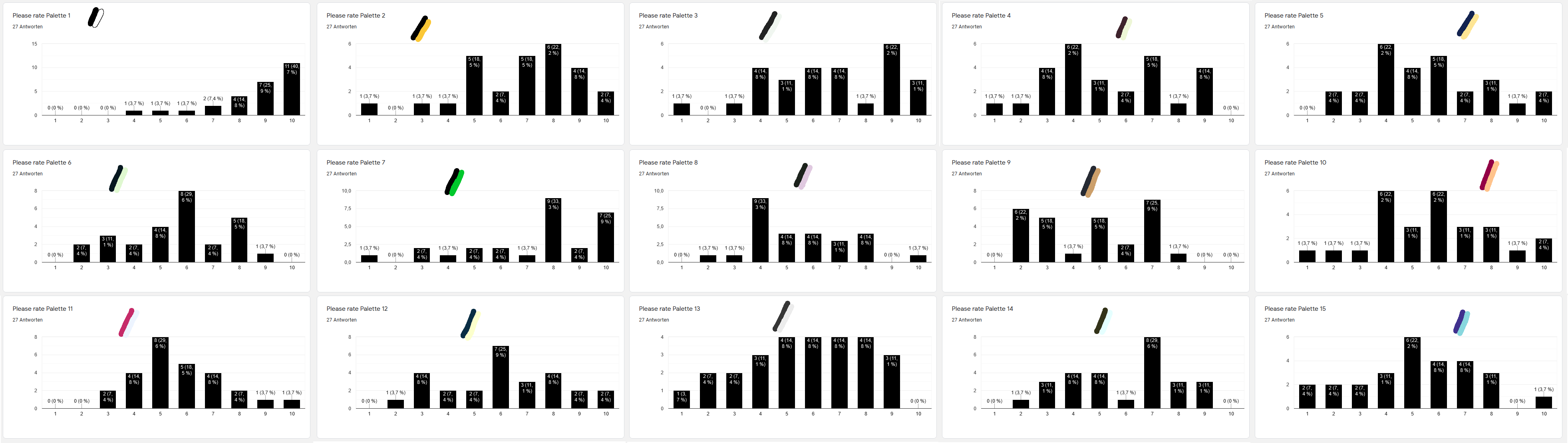
[11] The results of the survey
One more lesson learned: Saying a palette is smooth does not mean it has a low contrast. Palettes with calm colors also appear smooth. My Paper and Dust palette, used in Gamebomb, was voted on to be the smoothest palette, even though it has quite a big contrast. It is the calm yellow-brown that makes it look smooth. It isn't always the relation of the two colors to another that matters, but also the look of the individual colors.
It also rated Black and White as the sharpest one by average. That might be because Batfeula’s palette has a smooth yellow and the black with Apple II green has a calm green. They appear smoother with their calm colors, although it has a higher contrast to the eyes than Black and White have. Maybe a black and pink palette would’ve been rated sharper.
Fact is, however, that the participants did not tell themselves that Black and White has to be the sharpest, just for the sake of it. Only ten of the 27 participants rated Black and White as the sharpest palette. For nine participants it is tied with at least one other palette for the highest sharpness, and eight participants rated at least one other palette sharper than Black and White.
Still, Bat’s and Apple II are very far up, even if not above B/W. That shows that there is at least some connection between the survey and the calculated values.
Then why are people still using Black and White so often? Let me share my thoughts on that with you.
The main reason: It is neutral. Even shades of gray have a feeling to them: softness. See Gato Roboto's Soft palette for example, which really is just two shades of gray, and it appears soft. And of course, real colors are not neutral at all, blue is calm, red is dangerous, and each color has a lot of things associated with it.
Often you want exactly that when picking a palette. I used low-saturation brown instead of white very often, to make something look softer or older. It is easy on the eyes and associated with old paper, wood, and coffee with a lot of milk. I used dark purple instead of black very often, for a glow effect, that kind of looks like sunset shadows or effects from an old computer monitor. The colors have to fit the piece! It looks cool to have all art pieces in the same colors, and I will go over reasons to use the same palette every time later, but I personally make a new palette for each image, and that's what everyone interested in 1bit color palettes should do.
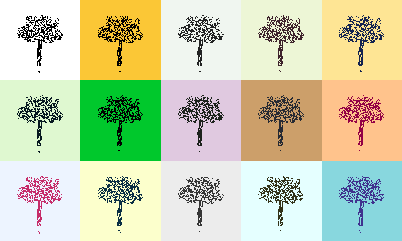
So sometimes you want a collection of art pieces in the same colors, and sometimes you want something that has no feelings or objects associated to them. Let's look at two artists that use Black and White, and the reasons for that. My buddy Blind Cherub, a talented theological horror pixel artist, is the first one. He does mostly horror art with calmer, scary, mysterious feelings to it, always black and white, and he has an interesting shading and dithering technique, where each element has a gradient, is black on the one side, and white on the other one, and has an outline in the other color each.
[12] The basics of Blind Cherub's art style, as shown in my 1bit tutorials
And yeah, Black and White is the best option here. First off, the mysterious vibe his art works have, just doesn’t fit any colors. No color fits fear. There are colors for sadness and pain, but not fear. If anything, maybe a blue-green. It is barely part of nature, not as calm as normal green or blue, and not associated with bright children toys, which is interesting in itself, since it’s one of the strongest colors in Cielab color space. I like blue-green, it is a great color and even has some retro vibes. But it is not creepy. There are no creepy colors. And the only colors that aren’t lively at all are black and white.
[13] Stray - I made the palette of this piece to be mysterious and otherwise emotionless, and while it's more dark green than green-blue, it worked out alright.
Another talented Black and White artist is Pixel Ninja. He does simple objects, one at a time, often in comic look. Like Blind Cherub, in high resolution, and with much dithering. His art style is punchy, he uses double outlines, different line thicknesses, big chunks of one color. He needs black for the strongest effect on that, and a color far away from that. He could use pink or yellow too, why did he choose white?
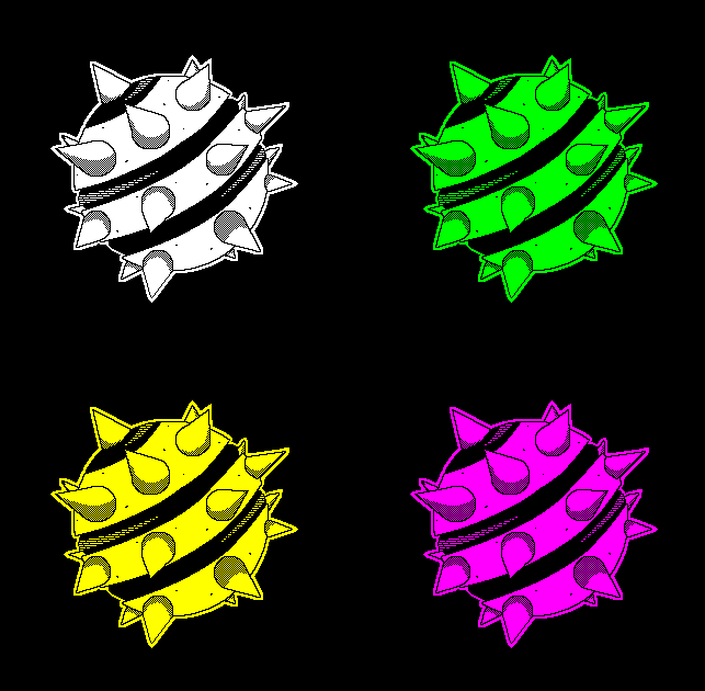
[14] My Art Style Theif post based on Pixel Ninja's art style with different mega contrast palettes
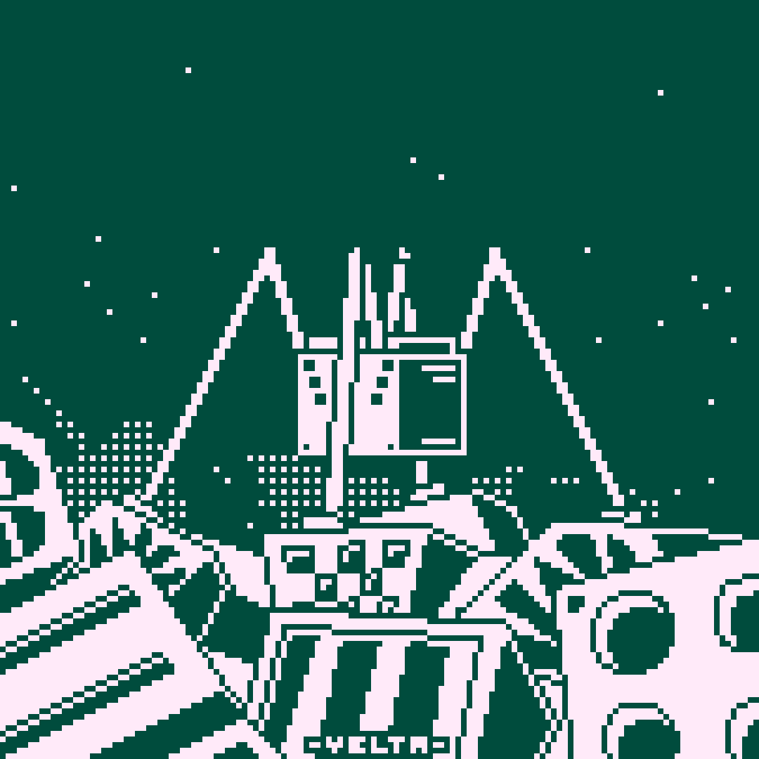
Again, because it is neutral. If you want to stick to the same colors every time, and still do completely different subjects, sometimes from real life, sometimes from fiction, with different vibes to them, just stick to the most neutral colors. This is the case in video games too. If you would make an image of the frog in Gato Roboto, you would choose Green and Brown maybe, or something with Gray. If you want the frog to be in the same color as the kitten, you'd already have trouble. You don't want the kitten to be green, and you don't want the frog to be a toasty brown! And what about the mecha, and the rocks and grass, flowers, machines, lava, enemies of all biological and technical kind? You better do something neutral. Minit, the 1bit segments of my own game, Fatnut’s game that I made the graphics for, and Last Order: Dungeons, by 1BBB member Fox Sox games, are all pure black and white. World of Horror is B/W too, but that’s because it’s horror, too.
The probably most famous modern 1bit game is Obra Dinn. Why is that one not Black and White then? Mostly, because it is 3D. There are no sprites that always appear the same way, it is just a lot of outlines, objects that appear tiny because they're far away, and different kinds of dithering. I can’t even explain it properly, but high contrast does no look good on noisy things. That’s an experience I had to make myself.
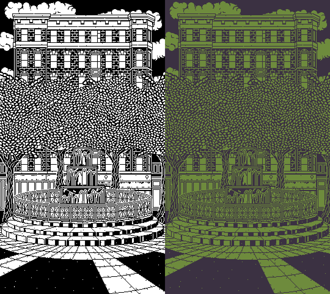
[15] The colored version is a lot more pleasing to look at
Another thing is that Obra Dinn tries to look retro, and is inspired by and dedicated to old 1bit games. The palettes available in the game are all imitating old 1bit computer displays.
[16] Obra Dinn's palettes are supposed to imitate old PC monitors instead of looking as beautiful as possible
And there are even more reasons to use B/W, that I will just skip over here: It looks like 1bit. You look at some pieces and think it's just a limited palette, but with d/l palettes, especially B/W, it gets clear quickly. For people who know something, but not too much about 1bit, it is also the most iconic, classic palette. Many won't even consider using other colors, because it doesn't look like the 1bit art works they know, often because they only played 1bit video games. And one last reason that I actually saw people use: It looks like a manga. Which is fair, they are black and white, and many pixel artists are closer to manga and anime styles than anything else.
Back to the main topic. We got fifteen palettes and a lot of values to extract from them. So I made the script sort the palettes by each of the values.
[10] The palettes used in this project. Top to bottom, left to right: Black and White ; Batfeula Signature by Batfeula ; Monitor Glow by Polyducks ; Pixel Ink by Polyducks ; にんじん Signature by にんじん ; StuntmAEn Bob Signature by StuntmAEn Bob ; Green and Black of the Apple II palette ; Bombstand palette by Yelta ; Paper and Dust by Yelta ; Funky Jam by Yelta ; Flowers & Asbestos by Yelta ; Starboard by Gato Roboto ; Soft by Gato Roboto ; Macintosh by Obra Dinn ; Commodore 1084 by Obra Dinn
So let’s have a look at the results:
| Category | #1 | #2 | #3 | #4 | #5 | #6 | #7 | #8 | #9 | #10 | #11 | #12 | #13 | #14 | #15 |
|---|---|---|---|---|---|---|---|---|---|---|---|---|---|---|---|
| Survey Average | 4.6 Paper and Dust |
5.2 Commodore 1084 |
5.4 Pixel Ink |
5.5 Bombstand |
5.6 Ninjin's, StuntmAEn Bob's |
5.7 Funky Jam, Flowers and Asbestos, Soft |
5.9 Macintosh |
6.1 Starboard |
6.6 Monitor Glow |
6.8 Batfeula's |
7.4 Apple II |
8.7 Black & White |
|||
| Survey Median | 5 Pixel Ink, Ninjin's, Bombstand, Paper and Dust, Flowers and Asbestos, Commodore 1084 |
6 StuntmAEn Bob's, Funky Jam, Starboard, Soft |
7 Batfeula's, Monitor Glow, Macintosh |
8 Apple II |
9 Black & White |
||||||||||
| RGB Difference | 39140 Commodore 1084 |
41936 Apple II |
44270 Paper and Dust |
54730 Funky Jam |
64422 Flowers and Asbestos |
97485 Ninjin's |
99372 Soft |
104046 Pixel Ink |
104721 Bombstand |
105518 Batfeula's |
120741 Starboard |
126200 Macintosh |
127808 StuntmAEn Bob's |
128982 Monitor Glow |
195075 Black & White |
| RGB Brightness | 244 Apple II |
504 Batfeula's |
600 Paper and Dust |
739 Bombstand |
742 StuntmAEn Bob's |
765 Ninjin's, Black & White |
806 Funky Jam |
828 Commodore 1084 |
830 Monitor Glow |
835 Starboard |
838 Pixel Ink |
866 Macintosh |
870 Soft |
1082 Flowers and Asbestos |
|
| Value Brightness | 78 Apple II |
98 Batfeula's |
100 Black & White, Bombstand, Paper and Dust |
109 Monitor Glow, StuntmAEn Bob's |
113 Soft |
120 Pixel Ink, Macintosh |
126 Starboard |
130 Ninjin's |
142 Commodore 1084 |
157 Funky Jam |
177 Flowers and Asbestos |
||||
| Saturation Sum | 0 Black & White, Soft |
4 Monitor Glow |
27 Bombstand |
56 Pixel Ink |
60 Macintosh |
73 Paper and Dust |
78 Batfeula's |
85 Flowers and Asbestos |
94 StuntmAEn Bob's |
100 Apple II |
103 Commodore 1084 |
104 Starboard |
117 Ninjin's |
145 Funky Jam |
|
| Hue Difference | 57 Funky Jam |
60 Monitor Glow |
65 Commodore 1084 |
96 Pixel Ink |
102 StuntmAEn Bob's |
107 Apple II |
120 Flowers and Asbestos, Macintosh |
139 Starboard |
164 Batfeula's |
171 Paper and Dust |
179 Ninjin's |
100 Black & White, Bombstand, Soft |
|||
| Saturation Difference | 0 Black & White, Monitor Glow, Soft |
7 Bombstand |
23 Paper and Dust |
27 Commodore 1084 |
30 Pixel Ink |
35 Ninjin's |
40 Macintosh |
55 Funky Jam |
62 StuntmAEn Bob's |
66 Starboard |
71 Flowers and Asbestos |
78 Batfeula's |
100 Apple II |
||
| Value Difference | 23 Flowers and Asbestos |
32 Commodore 1084 |
43 Funky Jam |
60 Paper and Dust |
68 Ninjin's |
71 Soft |
72 Pixel Ink |
74 Bombstand, Starboard |
78 Apple II |
80 Macintosh |
83 Monitor Glow |
85 StuntmAEn Bob's |
98 Batfeula's |
100 Black & White |
|
| HSV Difference (rounded) | 2079 Commodore 1084 |
6681 Flowers and Asbestos |
6885 Paper and Dust |
7167 Monitor Glow |
7541 Soft |
8025 Bombstand |
8321 Ninjin's |
9111 Macintosh |
11323 Starboard |
11461 Pixel Ink |
11872 StuntmAEn Bob's |
11958 Funky Jam |
12500 Black & White |
16967 Apple II |
18652 Batfeula's |
| Grayscale Value Difference | 123 Gamebomb |
140 Commodore 1084 |
146 Apple II |
163 Flowers and Asbestos |
167 Funky Jam |
175 Bombstand |
182 Soft |
194 Ninjin's |
199 Batfeula's |
200 Pixel Ink, Macintosh |
210 Glow |
211 Starboard |
219 StuntmAEn Bob's |
255 Black & White |
|
| Grayscale Brightness | 146 Apple II |
199 Batfeula's |
205 Paper and Dust |
239 Bombstand, Funky Jam |
255 Black & White |
256 Commodore 1084 |
259 StuntmAEn Bob's |
262 Ninjin's |
278 Monitor Glow |
282 Pixel Ink |
289 Starboard |
290 Soft |
298 Macintosh |
323 Flowers and Asbestos |
|
| Cielab Brightness | 35 Apple II |
41 Batfeula's |
42 Paper and Dust |
47 Bombstand |
50 Black & White |
51 StuntmAEn Bob's |
53 Wara's |
54 Ninjin's, Commodore 1084 |
56 Pixel Ink, Funky Jam |
58 Starboard, Soft |
59 Macintosh |
70 Flowers and Asbestos |
|||
| Cielab Difference | 4369 Paper and Dust |
5010 Soft |
5417 Funky Jam |
5441 Bombstand |
6406 Macintosh |
6685 Flowers and Asbestos |
6822 Pixel Ink |
6849 Monitor Glow |
7447 Commodore 1084 |
8318 Starboard |
8402 StuntmAEn Bob's |
10000 Black & White |
11211 Ninjin's |
12323 Batfeula's |
13631 Apple II |
| Cielab Hue Difference | 0 Black & White, Soft |
12 Monitor Glow |
386 Macintosh |
400 Bombstand |
720 StuntmAEn Bob's |
740 Pixel Ink |
1718 Paper and Dust |
1751 Starboard |
2707 Funky Jam |
4117 Flowers and Asbestos |
4537 Commodore 1084 |
5391 Ninjin's |
5482 Batfeula's |
8658 Apple II |
|
Note: Ninjin's means にんじん's here. I am using a name in latin letters here, so that it doesn't stand out as much. "にんじん" is pronounced Ninjin and means "Carrot". Usually I call them "Wara" though, since that were the letters in their twitter username back then.
If you have trouble understanding the table, let me give you some tips, and things to look out for: Look at the graph row for row. Do you understand what the Category means? If not, look it up in the 'Palette Properties' paragraphs! Now, do you understand why Black & White is where it is? Maybe even why it has this certain value? Then you can look at which palettes have larger, and which have smaller values. Do you understand why the palettes at the first and last places are there? You might notice big gaps, or numbers that are powers of two or ten. Is it a coincidence? Can you spot similarities between the palettes that the same artist created, even? Or between palettes that you think look similar?
Some things are surprising, most are not. That Black and White isn’t always an extreme is something I talked about enough now, but that was the main thing for me. I explained why the RGB results aren’t important too. We can tell that Black and White are often the same value as other palettes, which isn't always a coincidence.
With so many different numbers, there are two questions we ask ourselves: What do all these palettes have in common now? And: Which of the numbers actually matter? These are the questions that are important for making a new palette too. Luckily, there is a way to answer both at once.
By looking at how far each category's highest and lowest value are apart from another! If the values are spread around from zero to maximum, it’s just random numbers. Then we can tell that the category doesn’t matter at all. If the values are however all close to a certain point, with much space to the theoretical maximum and minimum, we can be sure that all palettes that are good are always close to that point.
By telling the script to look for each category’s maximum and dividing it by its minimum, we get this sorted list:
| Category | (Survey Median) | (Survey Average) | Cielab Brightness | Grayscale Value Difference | Grayscale Brightness | Value Brightness | Cielab Difference | Hue Difference | Value Difference | RGB Brightness | RGB Difference | HSV Difference |
|---|---|---|---|---|---|---|---|---|---|---|---|---|
| Min-max %-difference | 180% | 189% | 200% | 207% | 221% | 227% | 312% | 316% | 435% | 443% | 498% | 897% |
Let's ignore the survey results for a bit, since they are not subjective. Then, three of the top 4 "best" categories measure the brightness! Of course, the image wouldn't be visible if it was too bright or too dark. Even low-contrast art isn't always very bright or dark. Sure, it exists, but I wouldn't count it to the best palettes there are, and because of that didn't include them in this list of 15, which is why we got this result.
The different brightnesses are quite close to another, maybe 200% to 221% isn't enough of a difference to be completely sure here which one is better. But the data here shows that Cielab either is actually the best way to measure brightness, or is at least not much worse than the other options. To be honest, I expected it to be grayscale brightness, more on that next though. Since it's at least not RGB or HSV, it does make sense though.
And to put the brightness rule into numbers: The Cielab Brightness of your palette should be between 35 and 70. Finally a rule with numbers! Again, it isn't a fixed rule that will get you banned from Lospec if you don't follow it, but if you break it, you have to do it on purpose. Making a palette lighter than Flowers and Asbestos, or darker than Apple II, is not a good idea for universally appliable palettes, but maybe it fits a certain art work of you best. Or it has vibes to it that other palettes cannot have. To name the obvious examples here: extreme darkness if you want a horror image, or extreme brightness if you want to make an angel or something, are vibes too.
Let's take one more look at the min-max percentual differences, at the bottom this time. The RGB values are all there, so yes, it really isn't good for color theory. Proving the things that were obvious all along shows us that the calculations at least somewhat make sense. The only category further down than RGB is HSV Difference. In fact, all the HSV based categories are at the bottom, too. Just like RGB, it isn't made for color theory. And if you use multiple of it's different values at once, it makes even less sense: A low saturation also makes it brighter, so that we can have very similar colors with very different values! That makes no sense! If you use HSV for number-based color theory at all, which in simple things like hue shifting can be completely okay, don't use multiple values in one equation. This also counts for Cielab, and is the reason this way more intelligent number space has it's Difference calculation rated less important than HSV Value Brightness. With all of these categories out of the way and one chosen for brightness (checking for multiple ones that measure the same thing isn't neccessary), we only have Grayscale Value Difference left.
Grayscale! Surprising? Not really. Grayscale takes care of how our eyes see, that's why we use these oddly specific multipliers for each of the RGB values, when converting. The thing is, grayscale Values are equally good for computer displays, human eyes and printing, for the simple reason that it's just one value. You might even say equally bad, since it isn't able to show all of the colors, only grayscales, but for measuring Contrast and maybe Brightness objectively, this is perfect. Should we put that into numbers again just for the sake of it? Your Grayscale Value Difference should be at least 123 and as high as you want to. Note that Black and White are the highest possible contrast here, which of course is only the case for Brightness, not how they actually appear to our eyes, that's the main flaw here.
[17] The palettes used, with a grayscale filter applied to them
With the palettes sorted by properties, I had one last idea for analizing them: Now we can see which palettes are often on one of the extremes, and which ones are more balanced. Not that this would make any of them objectively better or worse.
The main problem here is how many points you give to what. Do you give one point for each extreme of each category? Give points for second and second last place too? Maybe more points for first than second? I settled on giving the max and min 4 points each, second from beginning and end 2 points each, and 1 point for the third and third last, and ended up with this list. So basically, many points mean it’s an unusual palette compared with the other ones:
| Palette | Apple II | Black & White | Flowers and Asbestos | Batfeula's | Paper and Dust | Commodore 1084 | Soft | Funky Jam | Monitor Glow | Wara's | Macintosh | Pixel Ink | StuntmAEn Bob's | Bombstand | Starboard |
|---|---|---|---|---|---|---|---|---|---|---|---|---|---|---|---|
| Points | 37 | 35 | 23 | 21 | 17 | 16 | 15 | 12 | 8 | 6 | 6 | 5 | 4 | 3 | 2 |
Let's be real, everyone said using Apple II in the 1-Bit Bad Bitches collab was a bad idea even before seeing this. And no, it's not a bad palette, but it's not very universal, and not what anyone except Batfeula was used to (still he was the most vocal about it on twitter).
The results vary a lot by what how many points you give to what, so we can’t compare them exactly to another. And I explained why some categories make no sense to use, but then still considered them here. Still, we can tell that the unusual palettes are in fact on top. The palettes I had to talk the most about, the darkest palettes and the ones with the highest contrasts, the lightest one and then the one I expected to have the smallest contrast, the Commodore 1084. And, as expected, the less special palettes, the ones that did everything right but don't stand out because of that, are at the bottom. I expected this list to be a lot less accurate, but it is quite exactly what I expected! Of course Starboard, Bombstand, StuntmAEn's and Pixel Ink are at the bottom, they're d/l palettes with comparably high saturation, always a safe path to take.
Maybe you read all of this text now, and understood it, and made some palettes before, but just wouldn't know where to start, when considering all of this. It's quite simple, actually. First you'll need a concept in your mind. Is the palette going to be d/l, d/c, c/l or c/c? This is quite an important question here. And: What hues will it be? Purple and yellow, or green and pink, maybe two hues that aren't opposites, like green and blue? Or two hues that are closer to another? If you have one color and one light or dark, you'll have to know which one is which already. Consider your art works subject here. You'll edit the colors in HSV, and always work inside the art work, not with two squares next to another!
In Dark/Light palettes, you should start with black and white. Put the Value and Saturation of the black up and choose a Hue that you like, according to your concept. Then you take the white, put Saturation up and pick a Hue fitting the other color you've thought off.
If you want to make a Dark/Color or Color/Light palette, always do the color first! Start off with a FF0000 red, and pick the Hue you want. If you want the color to be less strong, take some Saturation away. But not too much, the color will be the more Saturated one in the palette either way. Then you can make the color darker with the Value, if you like to. The second color of the palette just has to fit the first one. Start with black or white, add Saturation, change Value and Hue. Keep it closer to black or white than you would do in a d/l palette! Otherwise the contrast is too weak.
In Color/Color palettes you have to pay a lot of attention to the Hue. Start off with FF0000 red and 0000FF blue or something, and pick the Hues you want. This will be way too bright, but give you an idea of whether the Hue Difference is big enough. Then, you'll need to take away Saturation from both colors, and lower the Value of at least one of them. In most c/c palettes, one color is still clearly darker than the other one, which makes them more often than not more readable, and if you don't do this, you can't use any shading in your art work without it looking weird.
In most cases, this will now look terrible, but it'll be clear why. Is it too bright? Take away some Saturation. Too close to another? Increase the Value of one color and decrease it on the other one. The Hues don't go well together? Change them! Either just a little but, if that work, or just pick an entirely new one. Do this until you are happy with your palette. Keep in mind that you will be used to your art work and the colors by now, and that people looking at it for the first time might need a bigger contrast.
Now that you are happy with your palette, you might as well leave it at that. Now we will go into detail. The easiest thing is to ask a person around you for their opinion. Do they like the colors and the contrast? This would also be the point of time where you check your Grayscale Value Difference, which should be at least 123 to have a high contrast, and your Cielab Brightness, which should be between 35 and 70 to have your palette not be too bright or dark in general. If you had a special concept for your palette than included it being low contrast or very dark or light, you can break these rules on purpose. If not, you should strictly follow them.
Pure perfection you say? Then select the first color, put the Hue up by exactly two, and look at it. Does it look better? Then go up another two points. Does it look worse? Maybe go two down. You don't see a difference? Then pay closer attention! Keep going until both increasing and decreasing looks worse than the color you currently have. And then repeat this for Saturation, Value, and the values for the second color.
And there you have it. A good palette. When you upload your art work to social media, don't forget the #1bit! And if you are very proud of your new palette, upload it to Lospec!
For everyone scared by the amount of text so far, who just reads this part as summary, I'll make it short.
1bit color palettes cannot be computer generated or optimized by certain patterns that are always the same. A good palette fits art style, subject, feelings and personal preference of the artist. There are no specific patters in 1bit palettes, except for the fact that they have a contrast high enough and a brightness in the right area to be readable.
Although that was not the subject of this study, we learned a few more things. How the Cielab color space works, that Black and White are in fact not the highest contrast possible, but the only two neutral colors, that you can group 1bit palettes into d/l, c/l, d/c and c/c, which affects how hard the palette is to balance, how much it stands out from others, what feeling it has, but not it's quality.
Out of all the different values we calculated, the most important ones are Grayscale Value Difference, which should be at least 123, and the Cielab Brightness, which should be between 35 and 70. Infos on what that is and how to calculate it are further up under "Palette Properties".
The most important rated values were not calcuated though, but the survey results! This shows clearly that no matter how many calculations you do, the most efficient way to rate a palette is to just look at it from your subjective view. Maybe ask someone else about it.
To make a palette look smoother or clamer on the eyes, you can use a low contrast, or simply calm colors. This works well with pastell, but especially yellow-brown colors.
Mentioned on this page and helped with the project:
Polyducks - Twitter - Website
Mentioned on this page:
Batfeula - Twitter
Blind Cherub - Twitter
Gato Roboto - Website
Lospec - Website
にんじん - Twitter
Pixel Ninja - Twitter
Return of the Obra Dinn - Website
StuntmAEn Bob - Twitter
>Back to the front page