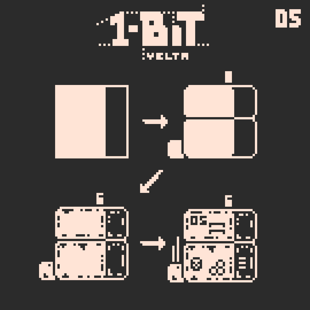
>Back to the front page

Y E L T A ' S    1 B I T    P I X E L    A R T

Tutorials

A    T E C H N I C A L    A P P R O A C H

Lesson 01

When drawing multiple shapes on top of another, make sure that there are no outlines that are wider than others! The shapes can touch each other or have another outline seperating them. Choose what fits your art work best and stay consistant in it!

Lesson 02

One method of looking at color palettes is with graph, where palettes are classified with Dark/Light, Color/Light, Dark/Color or Color/Color. In the corners we can see the extremes of those classes. For example, no palette can be more Dark/Light than pure black and white, therefore it is placed in the upper left corner. We could align every palette inside this graph if we wanted to.

Lesson 03

If you struggle to draw a shape from your mind, use another medium for reference. You could look up photos on the internet, draw a sketch on paper, model it in 3D or come up with other methods!

Lesson 04

These are the most used types of perspectives. When drawing something from the front or side, it is called orthographic and has "no perspective".
The top-down perspective is used in many video games. While it counts as ortographic as well, artists make a distinction here because it does not show one or two sides, but one side and the top of an object.
For a virtually three-dimensional perspective with the same angles on both sides we use the term "isometric".

Lesson 05

This is a common work flow for me when drawing buildings. In theory, I first just put down some blocky shapes, then I add all the objects and bring the blocks into the exact shape I want. Afterwards I add texture, random details or even shading.
In reality, my work progress would be all over the place, with some objects completely finished while still standing between big blocks.

Lesson 06

Negating the color of an outline is usually a bad idea. Use a second outline in the other color instead!

Lesson 07

This technique for creating shades somewhere between our two colors is what we call dithering. Like in the first example, it can be used for shading with transitions, or like in the second example, for textures like dirt.
Using dithering as color is really hard to pull of without looking bad. But if you still want to try, make sure to offset the dithering together with the object's outline to make it not look flat, like I did in example 3. Different ratios of dark to light pixels can create different shades like in examples 3 and 4.

Lesson 08

When creating an isometric object, single pixel differences can drastically change how smooth or sharp the object looks. Choose something that fits the object you draw and try to stay consistant!

Lesson 09

The easiest, although not most realistic way to project something onto tilted surfaces is by simply offsetting the image by, depending on the angle, one pixel every two rows, once ever row, twice every row etc. The darker pixels would have to be placed additionally to not break the lines and give the object depth.

Lesson 10

Making good looking cables or vines is the master discipline for clean linework. Avoid sharp corners, always use outlines, make the curves look smooth, pay attention that what you're drawing could be constructed in real life. On the right side you can see how it's done!

Lesson 11

You can spare a lot of time by using tiles to quickly create large patterns. Of course you can then still make them more interesting or less repetetive by modifying them afterwards.

Lesson 12

Fonts at small resolution are hard to make, since they consist of lines that would be too small to be imitated with pixels. Usually you can go by the rule "Recognisablity > Accuracy". Who cares whether you left out a line if the result looks better and is still readable?

Lesson 13

As a small introduction into style and the options to archieve this, here are seven methods of creating a bush that I saw in pixel artworks or came up with myself. Styles with a comic-like look often use clear lines to simplify the shape, while styles trying to imitate filtered photos are very noisy and you can't make out any elements, just the texture. Another variant developed specifically for pixel art is to draw each leaf individually.

Lesson 14

Here's another lesson on style: 7 types of clouds. Often, clouds are meant to just fit into the art work and not stand out, which means that there are a lot of different ways to draw clouds, fitting a lot of different styles. Again, texture-heavy clouds using dithering look more realistic than the clean comic-clouds.

Lesson 15

When writing text with pixel art, please create your own font! There are so many possiblities to create a letter even in the smallest sizes! Draw the letter the way you like them most, not the way someone else does them.

Lesson 16

When trying to archieve realism, you will have to use other perspectives than orthogonal or symmetric isometric. You could use different angles on each side of isometrical art or work with one to three vanishing points like you probably did in school.

Lesson 17

There are two main ways to shade curves: Either with line thicknesses or dithering. It is a question of style. Alternatively, if it doesn't matter too much for your art work, you could also use a sharp edge.

Lesson 18

Many people do not realise how easy it is to create random patterns with a brush tool of 1px size. Just randomly move your mouse around, switch colors and then move it around differently, in circles, zig zags or whatever comes to mind. Like this, you can create a lot of distinct textures to use in noisy, heavily shaded or photorealistic art work. I show four more examples of this in the video lesson on the bottom of this page!

Lesson 19

Of course shading is a question of art style too, not only for cylinders. Different amounts of dithering can create different amounts or realism, sharp edges can create a comic look and lines can look like a pencil drawing or manga.

Lesson 20

Water can be tricky to pull off with only two colors. It can be displayed with an irregular pattern imitating small waves, as reflection of the world, or simply as a big dark area with some reflections. Remember to make the edge of the water object clear!

Lesson 21

There are a lot of ways to dither. In variant #1, we have a repeating pattern, which can be broken to receive results like variant #2. In variant #3, I randomly placed the light pixels, and cleaned them up for version #4 so that no pixel touches another.
Note how variant #1 and #3 as well as #2 and #4 have the same amount of white pixels each, yet they look entirely different!

Lesson 22

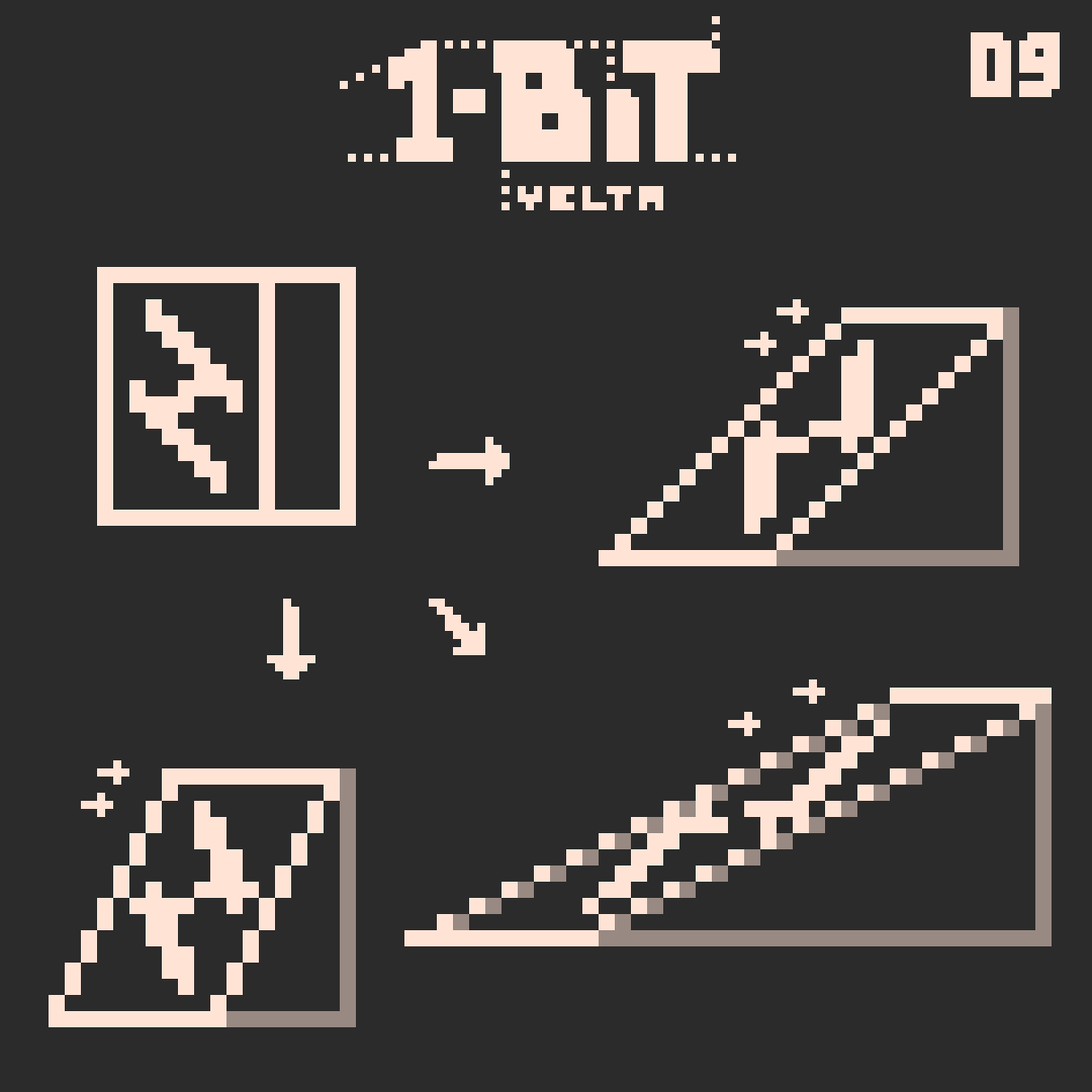
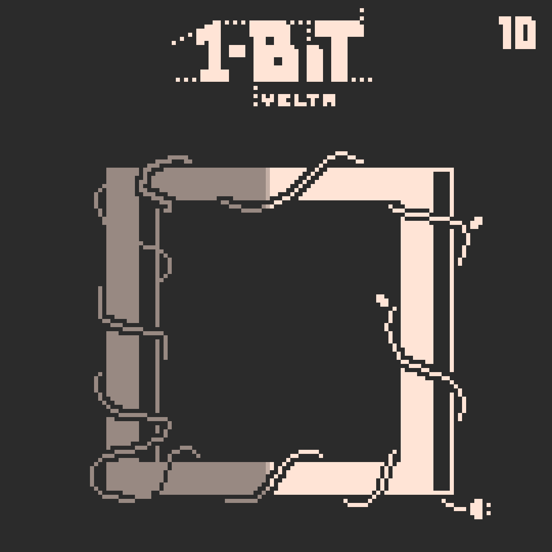
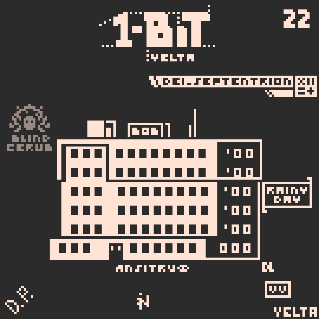
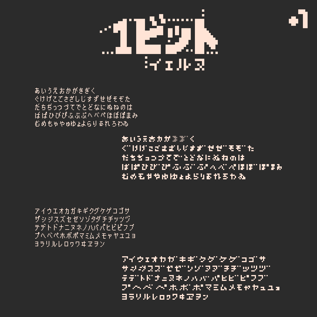
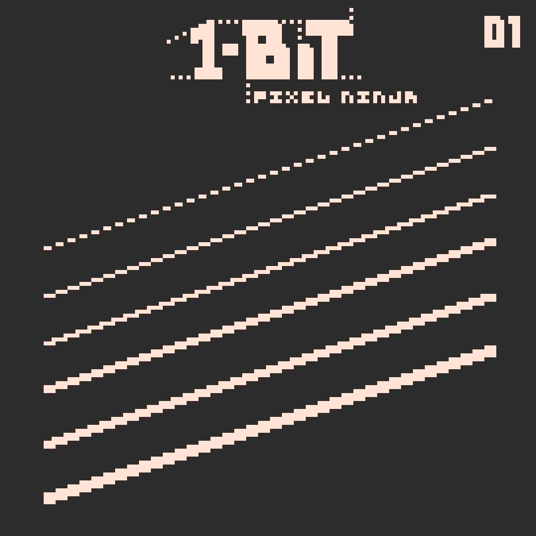
Sadly, you will always have to water mark your art before uploading it online to make sure it doesn't get stolen without anyone noticing. There are a lot of creative ways to do so though! I myself almost always just put my name in the bottom right corner, although often with experimental typography. Instead of your name, you can also use initials, your social media account, an iconic symbol or a combination. You can make a harder-to-see third color, put your name right inside the art work itself or make fancy decorations. All water marks on this image are real, created by some twitter friends for their art works.

Lesson 23

This art style is an interesting challenge and widely used, especially for dark settings. After drawing the shape, you create shading with different gray tones, replace them with dithering and then clean up and create transitions. If you want to, you can add an outline on the darker side to make the shape clearer.

Lesson 24

You don't even need lighting, shapes or anything like that to create different styles. Just by using filled shapes or lines with different thicknesses you can give very different vibes to a piece of art.

Lesson 25

Adding extra outlines inside an object can make it sharper and punchier. Though, like with outlines around an object, it also makes them look more comic-like and less realistic - it's your choice.

Lesson 26

This is an art style I came up with myself, so I kind of had to make a lesson on it, even though it's not 1-bit. You create an object with multiple colors, take away every second row and column and then connect the points you're left with to create a cool, traditional and mysterious looking pattern.

Lesson 27

Cleaning up line work can be very tedious, but is almost always worth it. The key rule is to always use the same line width and to keep it even where multiple lines meet each other.

Bonus Material

As a challenge to myself and a proof to everyone else, I created almost all of the japanese Kana in just five pixels height! While latin letters can be made with as little as 3 pixels height, japanese artists often struggle to use text inside small resolution pixel art. I hope this can help!

Stolen Knowledge 01

Make use of line thicknesses like Pixel Ninja! Experiment with line widths between natural numbers as well.

Stolen Knowledge 02

The dither-heavy dark art style we learned in Lesson 23 is close to what Cherub did in many of his art works from 2021, but he has a very special version of it, which uses different outlines or other seperators on each side.

Stolen Knowledge 03

For a strong comic look, you can use the darker color for both shading and coloring in the same art work like Rainy Day.

Stolen Knowledge 04.1

Here are four ways to add glitch effects to an art work like //VLAD does it.

Stolen Knowledge 04.2

Postmodern took glitch effects to the next level. He's very experimental with it and was brave enough to take away big chunks of the art work for these effects.

Stolen Knowledge 04.3

As you can tell, I'm a big fan of glitch effects, so of course I came up with a few myself.

Stolen Knowledge 05

If you see Pixel Ninja in tutorials, you already know it's about punchy look and outlines! Sometimes he used three outlines with 1.5px width for extremely sharp shapes!

Stolen Knowledge 06

And here we have our expert on dithering again! Putting some irregularities inside the dithering can give it a lot of texture and make it look even more realistic on most objects.

Stolen Knowledge 07

Instead of drawing a floor undearneath each art work, Batfeula thought outside the box and just left it away. He used other objects like grass and flowers to signal where it is supposed to be.

Stolen Knowledge 08

As always very experimental and clever, Ouroboros often used frames to display multiple objects next to another, and he even broke them at some places to use them exactly as he wants. It's not about realism, it's about looking cool.

Video Lesson 01

I talked about it in Lesson 18 before, but I got multiple messages by people that still weren't able to create random patterns, so I captured my way of doing it on video. It really is not that hard, just hard to explain!

3x3 Shape Study

This is a tiny study I made, and an attempt to make up as many terms as possible for future artists to learn in 1-bit classes in school. As you can see, it is possible to make cool looking rows with small objects that do not have any meaning. And this is the case for bigger shapes as well!

Mentioned on this page:
Batfeula - Twitter
Blind Cherub - Twitter
Pixel Ninja - Twitter
Postmodern Ouroboros - Twitter
Rainy Day - Twitter
//VLAD - Twitter

Pixelninja, Batfeula, Blind Cherub and Postmodern Ouroboros have always been my biggest pixel art idols and heavily shaped my style since I draw.
I am deeply honored to be in contact with them and all the other amazing artists and nice people I met on my journey so far!

>Back to the front page